Always look at your data!
Descriptive statistic measures are just not enough. We could all sound intelligent by predicating the statistics jargon and shouting out descriptive statistics and still be completely wrong in our inference of data. Here is a point that less academic people like us will welcome: the importance of visualising the data before applying models or proceeding to your results phase.
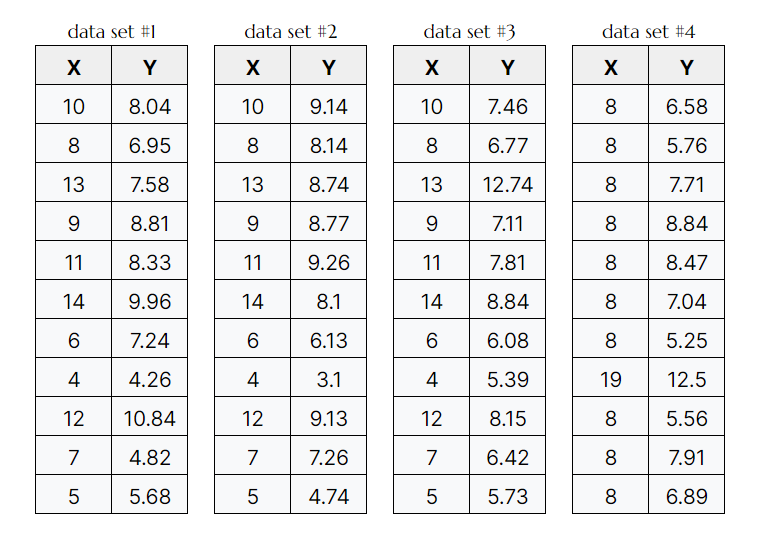
Consider The Anscombe's Quartet (created by Francis Anscombe), a group of four datasets which are nearly identical in simple descriptive statistics:

By comparing all X's and Y's we quickly notice that they all share the same mean and standard deviation, variance, correlation and line of best fit.

We could rapidly come to conclusion that the points between the four data sets are very similar. This would be misleading, as we will see once we plot the data. It turns out that this simple dataset is not interpretable by any regression algorithm which is fooled by the peculiarity.
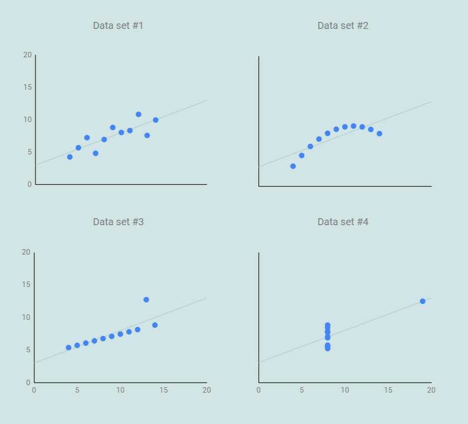
So how similar look these? It turns out, not very.

Only dataset #1 actually fits the linear regression model. For the rest, they are either impacted by outlier which cant be described by the model, or really just not a good fit for a linear model (dataset #2).
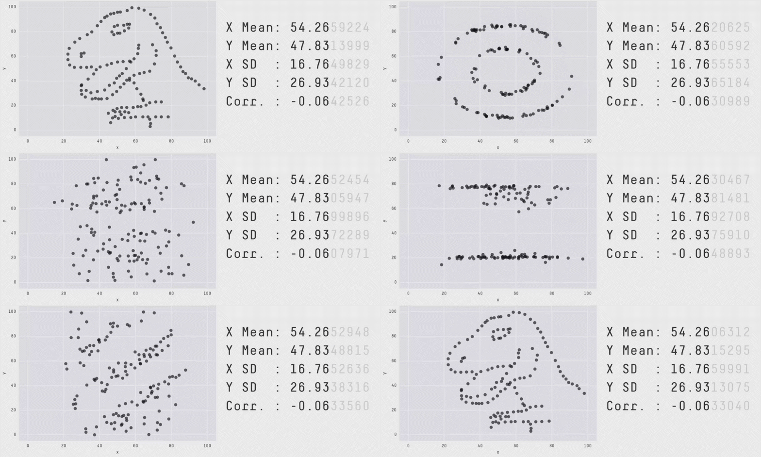
Some people have gone further into to find amusing shapes like stars, circles, and even the infamous Datasaurus (first created by Alberto Cairo), also known as the Anscombosaurus, honoring Francis Anscombe's quartet.

There is a reason why we should spend some time exploring data, including vizualisations. Because wildly different data can give similar results, relying only on numerical summaries like mean, variance, or correlations can be dangerous.
Always look at your data!